Vector files (AI, EPS, PDF with outlines) are best for custom USB drive printing. Here is why, what we can and cannot work with, and how to set up the file so it prints correctly on the first try.
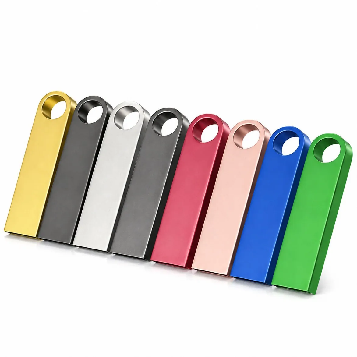
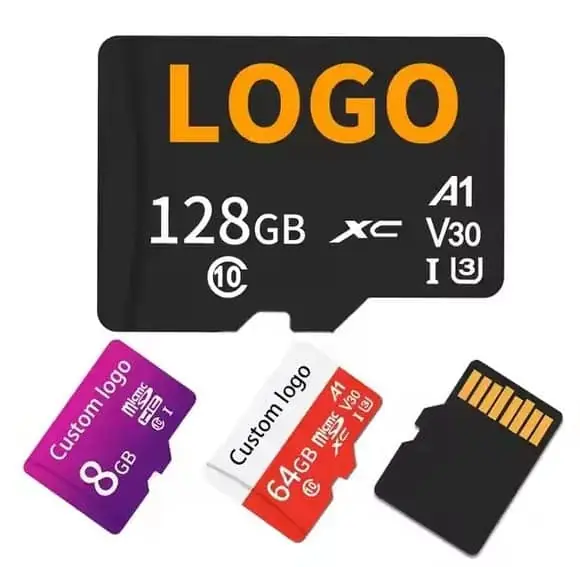
For custom USB drive printing we always prefer vector files: Adobe Illustrator (AI), EPS, or PDF with all text converted to outlines. Vector files scale to any size without losing quality, which is essential for small surfaces like USB drives and microSD cards. We can also work with high-resolution PNG or TIFF files (300 DPI or more at actual size), but the result will not be as sharp, especially for text and fine lines. JPEG files can work for full-colour UV prints but are never ideal for logos or text. WINTEL supplies this from its own plant in Shenzhen, China.
The short answer: send a vector file — AI, EPS, or PDF with text outlined. It will print cleanly, sharply, and on the first try.
The single most common “can you fix this?” I get is a logo saved as a JPG from a website, blown up to print size, and expected to be crisp. It cannot be. The file format decides whether your logo prints sharp or blurry, and the difference is free to get right.
Nine out of ten delays I see start with an artwork file that is not actually printable. The fix is five minutes if we catch it before proofing, a week if we catch it after.
People send us all kinds of files — JPEGs pulled from websites, screenshots, Word documents, PowerPoint slides. We can work with some of them, but the result is never as good as a proper vector file.
This page covers what we need, why we need it, and how to set it up so your print looks exactly like your brand.
File formats, ranked from best to worst
| Format | Type | Print quality | Our recommendation |
|---|---|---|---|
| AI (Adobe Illustrator) | Vector | Excellent | ✅ Always preferred |
| EPS | Vector | Excellent | ✅ Great, works in every program |
| PDF (vector, text outlined) | Vector | Excellent | ✅ Best for cross-platform |
| SVG | Vector | Very good | ✅ Good, but check effects |
| PNG (300+ DPI) | Raster | Good for photos, OK for logos | ⚠️ Acceptable for UV print |
| TIFF (300+ DPI) | Raster | Good | ⚠️ Acceptable |
| JPEG / JPG | Raster | Fair to poor | ❌ Avoid for logos and text |
| GIF / BMP | Raster | Poor | ❌ Never use for print |
| Word / PowerPoint | Mixed | Usually poor | ❌ Do not send — export as PDF first |
The key divide is vector vs raster. Vector is made of mathematical shapes that stay sharp at any size. Raster is made of pixels — zoom in and you see the blocks.
For something as small as a USB drive or a microSD card, that difference matters a lot. A blurry 5-pixel line on screen becomes a blurry 0.1 mm line on the drive.
The most common problem: live fonts
This is the number one reason artwork gets sent back for revision.
You send a PDF. It looks perfect on your screen. We open it, and the text is replaced with a different font, or it is all garbled, or it is missing entirely.
Why? Because the file still has “live” text, and we do not have the exact same font installed on our computers.
The fix is simple: convert all text to outlines before sending.
In Illustrator: select all text → Type → Create Outlines (Ctrl+Shift+O / Cmd+Shift+O)
In other programs, export to PDF and look for an option like “embed fonts” or “convert text to paths.”
How to set up the artwork correctly
Follow these rules and your print will look exactly like you expect, on the first try.
Size and position:
- Create your document at 100% of the actual print size
- Leave at least 1 mm margin from every edge
- Keep text and important details inside a 1.5 mm safe zone
- If you need exact centering, draw it centred on the canvas
Colour:
- Use CMYK for screen print and UV print
- Use spot colour (Pantone) if you need a specific colour match
- Embed the colour profile in the file
- Do not use RGB only — convert to CMYK before sending
Layers and effects:
- Flatten transparent layers if your print method is screen or pad
- Convert all strokes to outlines (especially thin strokes)
- Remove any hidden layers you do not want printed
- If you used special effects (drop shadows, glows), check if they are vector or raster
Final check before sending:
- Zoom in to 400% — does everything still look sharp?
- Convert all text to outlines
- Embed all images
- Save a copy and reopen it to make sure nothing is missing
What we can do with bad artwork
If you only have a low-resolution JPEG or a blurry PNG, all is not lost. We have options:
- Simple tracing — if your logo is a clean shape with 1–2 colours, we can vectorise it for a small fee. Takes 1–2 days.
- Complex redraw — if it has fine detail, gradients, or lots of elements, we can redraw it by hand. More expensive, but the result is perfect.
- Print as-is — if it is high enough resolution for the print size, sometimes it is fine. We will tell you honestly whether it will look good or not.
We never print something we know will look bad. If your artwork is not good enough, we will tell you what the options are and let you decide.
How to send it
Email the artwork file to us, along with:
- The order reference or quote number
- Which body style it is for
- Which print method (if you know — if not, we will recommend)
- Any special instructions (centred, top-aligned, specific size etc.)
If the file is over 10 MB, use WeTransfer or a similar service and send us the link.
The 30-second pre-send check
Before you hit send, ask yourself these three questions:
- Is it a vector file? (AI, EPS, PDF, SVG) → yes = good
- Is all text converted to outlines? → yes = good
- Does it look sharp zoomed in to 400%? → yes = good
If all three are yes, you are golden. If not, it might still work — but it will take longer and might not look as clean.
Have a file and want to know if it is print-ready? Send it over and I will look at it within one working day — no charge, no obligation. I will tell you exactly what needs fixing, if anything.
I would rather send your file back once with a clear list than print 500 drives with a fuzzy edge you cannot un-see. Good artwork is the cheapest quality control you have.
File format → what it is good for
| Format | Best for | Will bite you if |
|---|---|---|
| AI / EPS / PDF (vector) | Crisp at any size, editable | The fonts are not outlined and we cannot open them |
| PSD / layered TIFF | Photo artwork, complex layers | It arrives flattened with the wrong colours baked in |
| High-res PNG (300+ dpi) | Simple logos when vector is unavailable | The resolution is actually 72 dpi “upscaled” |
| JPG from a website | Nothing printable | It is 200 px wide and blurry the moment it grows |
| Word / PowerPoint | Nothing | It is not a production file, full stop |
If all you have is a JPG, tell me — I would rather redraw a clean vector from your reference than print a soft edge you cannot un-see.
Frequently asked questions
Why can you not just use a JPEG from our website?
Website images are usually 72 DPI and compressed. When we print them on a drive — especially at small sizes — they look pixelated and blurry. Vector files stay sharp at any size.
What does 'convert text to outlines' mean?
It means turning the text into vector shapes so the file does not need the font installed to print correctly. If you send a live font and we do not have it, it will render wrong.
Can you redraw my logo if I only have a low-resolution file?
Yes. We can usually trace a clean logo from a low-res image for a small one-time fee. It takes 1–2 days and the result is a clean vector file you can use for anything.
Should I set up the artwork at the actual print size?
Yes — 100% scale. If the print area is 30 × 10 mm, create a document at 30 × 10 mm and place your artwork inside it at the size you want it to appear.
What colour mode should I use — CMYK or RGB?
For screen and pad printing, CMYK or spot colour (Pantone). For UV print, either works but we prefer CMYK for colour accuracy. Always embed the colour profile.