
PMS numbers do not reproduce exactly on plastic. Why the same Pantone looks different on ABS, PVC and metal, and how to approve a colour you can actually repeat.
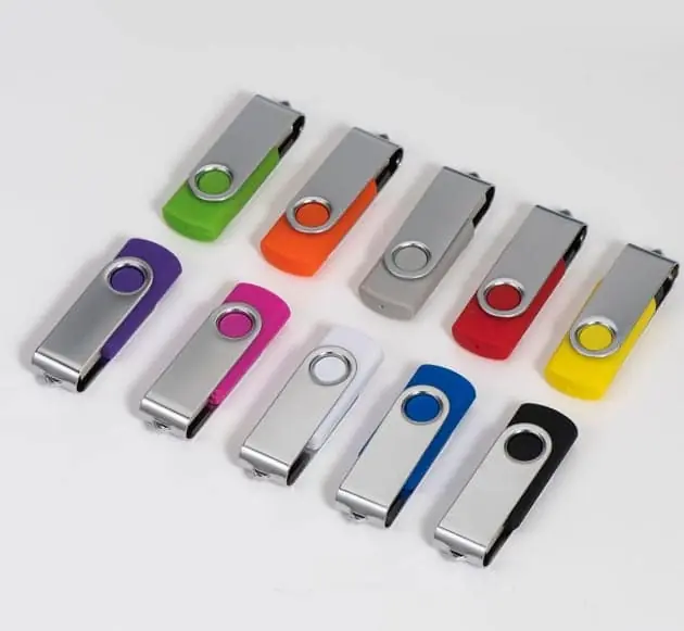
A Pantone number cannot be reproduced exactly on a plastic USB shell, because the reference is printed on paper and the shell is a moulded, textured, sometimes translucent material. The practical route is to give the Pantone as a target, ask for a physical colour sample in the actual material and finish, and approve that sample rather than the number. The approved sample then becomes the standard for the production run, and the Pantone code is recorded as reference only.
The short answer
Give the Pantone as a target, approve a physical sample as the standard. The number starts the conversation; the sample ends it.
A Pantone reference is a printed ink standard on paper. A USB shell is a moulded, textured, sometimes translucent object that reflects and transmits light differently. The two will never agree exactly, and pretending otherwise leads to rejected shipments and arguments about whose light source is correct.
| What you provide | What it controls | What it cannot control |
|---|---|---|
| Pantone number + suffix | The starting target | How pigment behaves in plastic |
| Material and finish | The surface that carries the colour | Batch-to-batch drift |
| An approved physical sample | What counts as acceptable | Nothing, once it is signed |
| A stated tolerance and lighting | How disputes get settled | Colour outside the tolerance |
Why the same Pantone looks different on plastic
Four things change between the paper swatch and the shell in your hand.
The substrate. Paper scatters light through a fibrous matte surface. Injection-moulded ABS is smooth and glossy; it reflects a sharp highlight and darkens the rest of the surface. The pigment has not changed, but the light coming back to your eye has.
Translucency. Soft PVC and frosted plastics let light pass into the material and bounce around inside before leaving. A translucent shell looks lighter at the edges and darker where it is thick. This is why a colour that reads correctly on a flat chip can look washed out on a curved, thin-walled body.
Texture. A fine matte texture diffuses light and desaturates the colour slightly. A polished surface does the opposite. Two shells with the same pigment and different tooling finishes are not the same colour to a customer.
Wall thickness and curvature. Thicker sections of the same material appear more saturated. A logo area recessed into the surface sits at a different depth and sometimes in a different shade.
None of these are faults. They are the physics of colour on a three-dimensional plastic part, and they are why the physical sample is the only meaningful approval step.
Reading the suffix: C, U, TPG, TCX
A Pantone number without its suffix is ambiguous, and confusion here causes real disputes.
| Suffix | Library | Surface it was specified for |
|---|---|---|
| C | Coated | Coated paper — gloss or silk stock |
| U | Uncoated | Uncoated paper — absorbent, matte stock |
| TPG | Textile, paper | Textile colours shown on paper |
| TCX | Textile, cotton | Textile colours shown on cotton |
The coated and uncoated libraries contain different numbers of colours and different values for the same number, so “3405” alone is not a specification. If your brand guidelines give a C value and your packaging uses uncoated kraft board, the two references may already differ before any plastic is involved.
When a customer sends a hex value alongside the Pantone — as happens when a design file has to serve both screen and print — treat the hex as a screen approximation and the Pantone as the closer reference, and then confirm both against the physical sample. A hex value rendered on an uncalibrated monitor is the least reliable of the three.
Which materials match faithfully, and which do not
| Material and finish | Predictability | What to expect |
|---|---|---|
| Painted metal | Highest | Colour sits in a controllable surface layer |
| Opaque ABS, matte | High | Stable, consistent across batches |
| Opaque ABS, gloss | High | Reads darker than the paper swatch |
| Soft PVC | Lower | Translucency shifts shade with thickness |
| Frosted or translucent plastic | Lowest | Colour changes with the light behind it |
| Wood | Not applicable | Grain and stain variation dominate |
If brand colour accuracy is a hard requirement — for example when the drive must sit next to printed collateral on a trade stand — specify an opaque material and get the sample approved in that exact material. Asking a translucent material to hit a coated-paper reference is asking for a conversation you will have again on every reorder.
How to run colour approval so it holds
A workable sequence, in order:
- State the reference properly — number plus suffix, and say plainly that it is a target.
- Name the material and finish — opaque ABS, painted metal, soft PVC, gloss or matte.
- Ask for a physical sample in that material — not a printed chip, not a screen render.
- Judge it under the light your end user will see — daylight, office lighting, or a retail spot, not a screen.
- Photograph and record the approved sample — with a date and the reference it was approved against.
- Put the tolerance in the purchase order — and name the lighting condition for judging it.
- Keep a retained sample from the first run — it becomes the reference for every reorder.
Step 5 is the one most buyers skip, and it is the one that saves the most money. A photograph of an approved sample, taken under stated lighting, settles most disputes before they start.
What it costs, and why
Pantone-matched colour usually carries a charge, and there are two quite different routes behind it:
- Custom-compounded pellets. The factory orders material to a colour, which carries a minimum purchase quantity. Your order may use only part of it, and the surplus is either charged to you or absorbed into the unit price.
- Painting to match. The shells are moulded in a base colour and then coated. This adds a process step, a rejection rate, and a risk of wear at edges and around the connector opening.
Ask which route the quotation assumes. Compounded pellets and painted shells behave very differently on a repeat order: the pellet minimum is a one-time barrier, while the painting step is a recurring cost that never goes away.
A stock colour from the factory’s existing range avoids both. If the brand colour is close to a stock option, moving it a small distance can be much cheaper than matching it exactly — and in most promotional applications nobody will notice.
Pre-production sample: set expectations on the round trip
Colour approval sits inside the sample stage, and the sample stage is where schedules slip. Realistic planning:
| Step | Typical elapsed time | What can go wrong |
|---|---|---|
| Colour sample in material | Several working days | Material not in stock |
| Courier to you | Several working days | Customs, remote address |
| Your review | Your call | Judged under the wrong light |
| Revision and re-sample | Repeats the above | A near-miss becomes a second round |
The most expensive mistake is approving a colour from a photograph on a monitor. The second most expensive is discovering, after mass production, that the approval was given against a chip rather than the actual material. Both are avoidable by spending a few days on the sample.
For how the sample stage fits into the wider order, see why lead time moves and what you control. If your project combines a colour with a logo application, which logo method suits a black metal USB drive covers the marking side of the same decision. And if you are choosing between box constructions, solid walnut versus walnut veneer explains how the material changes what a printed colour can do.
What to do when the colour arrives wrong
It happens, and the response depends on which kind of wrong it is.
- Outside the agreed tolerance against the approved sample. This is a specification failure. Document it under the stated lighting, photograph it beside the retained sample, and raise it before the goods are accepted.
- Inside the tolerance but not to your taste. This is a judgement call, and the tolerance you agreed is what governs. If the tolerance was never written down, you have little to stand on — which is the argument for writing it down at the start.
- Correct against the sample but wrong against the Pantone. This is the expected outcome, not a defect, and it is why the sample governs. If the Pantone match matters more than the sample, that has to be said before production, not after.
The one-line version
Send the Pantone with its suffix, name the material, demand a physical sample in that material, approve it under real light, photograph it, write the tolerance into the order, and keep a retained sample. The number is a target. The sample is the contract.
If you want a colour sample made in a specific material before you commit to a run, send us the Pantone reference and the material and we will tell you what it will look like, what it will cost, and where it will land relative to the paper swatch.
Sources
Frequently asked questions
Why does the same Pantone look different on my USB than on my business card?
Because the Pantone reference is a paper standard and your drive is not paper. Paper is a matte, opaque, light-scattering substrate; a plastic shell is smoother, may be slightly translucent, and reflects light differently. Add gloss or matte finish, texture, and the curvature of the shell, and the same pigment reads as a different colour. This is expected, not a defect, and it is why a physical sample is the only workable approval.
What does the C or TPG suffix after a Pantone number mean?
The suffix tells you which Pantone library the number comes from, and therefore what surface the colour was specified for. The C suffix refers to the coated paper library, and the U suffix to uncoated paper. TPG and TCX refer to the textile libraries, where TPG is the paper version and TCX the cotton version. A number is only unambiguous together with its suffix, and a colour matched from the coated paper library will need translation to reach a moulded plastic part.
Which USB shell materials match Pantone most faithfully?
Painted or coated metal and opaque ABS are the most predictable, because the colour sits in a stable surface layer that can be matched and measured. Soft PVC and translucent or frosted plastics are the least predictable, because light passes into the material, the wall thickness varies, and the perceived colour shifts with the light behind it. If brand colour accuracy is a hard requirement, specify an opaque material and get the sample approved in that exact material.
Can you send a colour sample before I commit to production?
Yes, and you should insist on it. A colour sample — sometimes called a colour chip, a dip sample or a pre-production sample — is a physical piece in the actual material and finish. Approve it against the Pantone under the lighting you expect your end users to see it in, and keep a signed or photographed record. Ask also whether the sample comes from the same material batch as production, because a colour approved on one batch of plastic pellets is not automatically guaranteed on the next.
How much colour variation is normal between production batches?
Some variation is unavoidable, because plastic pellets are compounded in batches and moulding conditions drift. The realistic approach is to agree a tolerance rather than to demand an exact match. Many buyers work to a visual assessment under defined lighting, backed by an instrument reading where the material allows it. State the tolerance in writing, and keep an approved physical sample from the first production run as the reference for later runs.
Does a Pantone-matched shell cost more than a stock colour?
It usually costs more, in one of two ways. Either the factory buys custom-compounded pellets with a minimum quantity, which you may be paying for in full even if your order uses a fraction of it, or the shells are painted to match, which adds a process step and a rejection rate. Stock colours from a factory's existing range carry neither charge. Ask which of the two routes the quotation assumes, because they behave very differently on a repeat order.
What should I put in writing on the purchase order?
Three things: the Pantone reference with its suffix as a stated target rather than a guarantee, the identification of the approved physical sample that governs acceptance, and the agreed tolerance and the lighting condition under which it is judged. A purchase order that says only 'colour: Pantone 3405 C' leaves both sides guessing, and a dispute over shade is expensive to resolve after the goods are made.